
Current: Visuals Allrounder Superfamily (Identity Letters), Branding DIE GROSSE 2024. Past (selection): Rebranding RLT (read the article), DIE GROSSE 2019—2022.
Books and Brands. Period.
Tipogris takes care of typography, writing, and good design. For high-quality books and publications. For brands with values. For strong identities. For cultural institutions and industrial corporations.
Why? Because there’s something good and something true in everything, waiting to be made visible by a precise branding and well-honed words. Because carefully crafted design systems can make the world a bit easier. And because there’s no better means to this end than language and type.
»No matter if art or design—it just has to be good.« (Anton Stankowski)
Happy to serve:


News
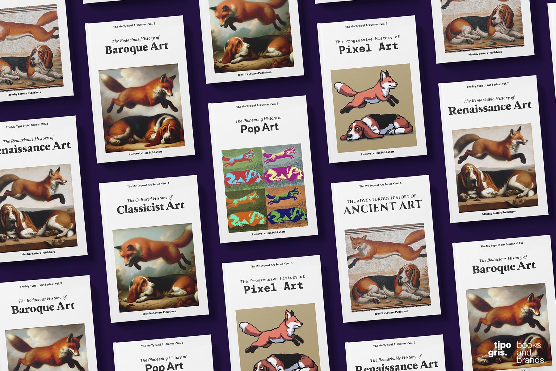
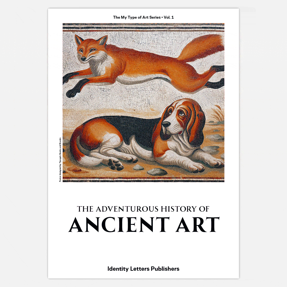
AI-powered Poster Design for the Allrounder Superfamily
“Allrounder” is Identity Letters’ signature superfamily. Since 2019, “Allrounder” has assembled font families that harmonise particularly well with each other, allowing for a variety of combinations even in complex layouts.
The usual approach in a superfamily is basing sans and serif on a common “skeleton”. But for Allrounder Grotesk, Allrounder Antiqua, and the other Allrounder members, type director Moritz Kleinsorge went another route: he used the design principles of a different era or style as a style guide for each family member. That way, the foundation for each subfamily is independent. The metrics and texture, on the other hand, are adapted and harmonised: all fonts have the same x-height and the same cap height. Identical weights make for the same colour on the page, even in different subfamilies.
To celebrate the complete rejuvenation of the superfamily and the publication of new subfamilies, Tipogris not only took care of writing and graphic design for Allrounder 2.0, but also used AI prompting to design posters in the style of art history book covers based on the respective eras that inspired the fonts.
The posters, printed on high-quality paper using sustainable processes and vegan ink, are free upon purchase of at least one Allrounder family package. Learn more
News
Copywriting & product naming for Identity Letters
Identity Letters was launched in December 2020 by graphic and type designer, Moritz Kleinsorge. A young boutique type foundry based out of Germany, close to the Dutch border, Identity Letters produces fonts to the highest conceptual and technical standards and offers expert-level type services.
Tipogris has provided extensive copywriting for the entire website (with about 11.000 words at the time of launching) as well as product naming. We paid special attention to the licensing system, Identity Letters’ unique selling point. These sweet & easy licenses make purchasing fonts a piece of cake—we communicated their benefits in clear and vivid words.
We’re delighted that identity-letters.com is now up and running. Congratulations to the foundry team on launching this shop! Take a look around on the website and you’ll surely find a font that suits your type.
News
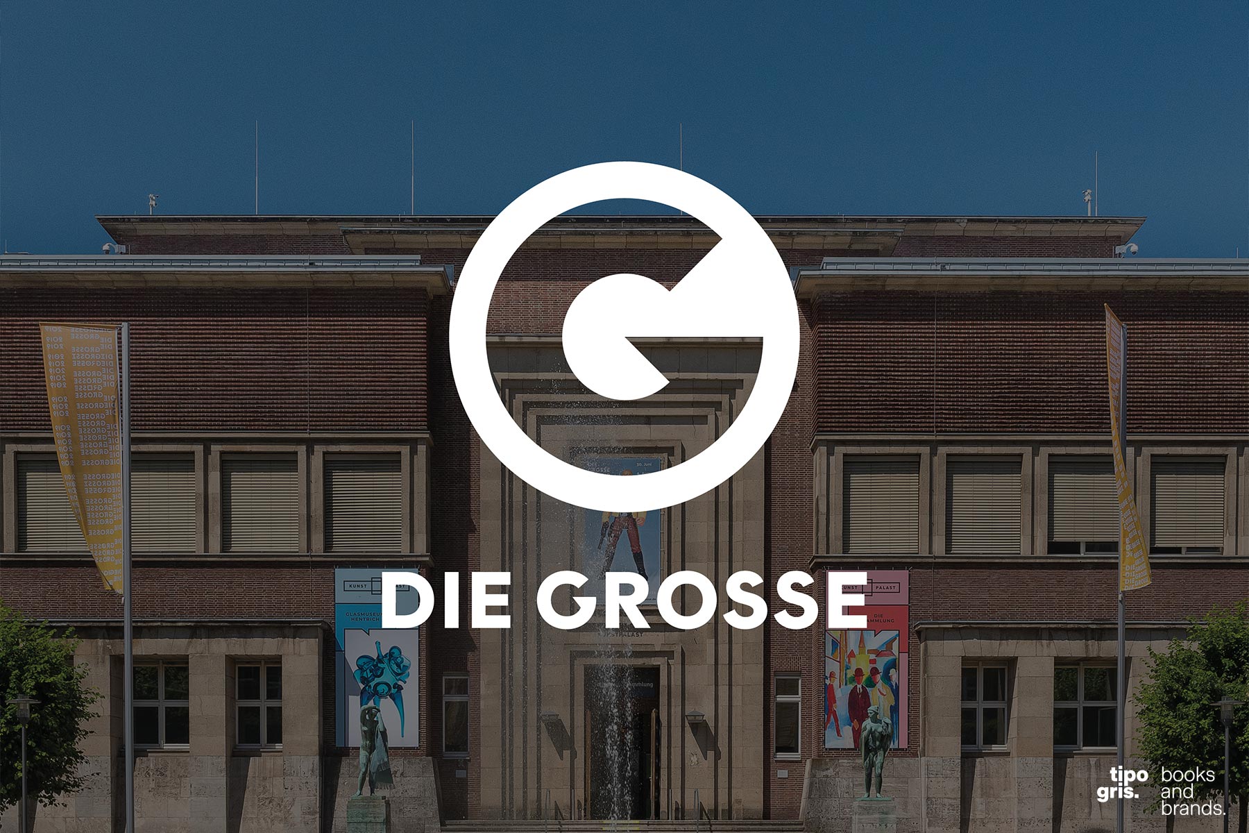
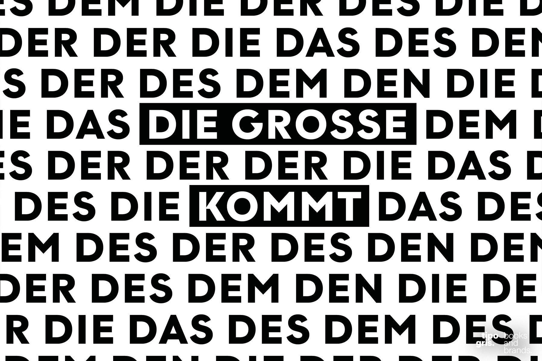
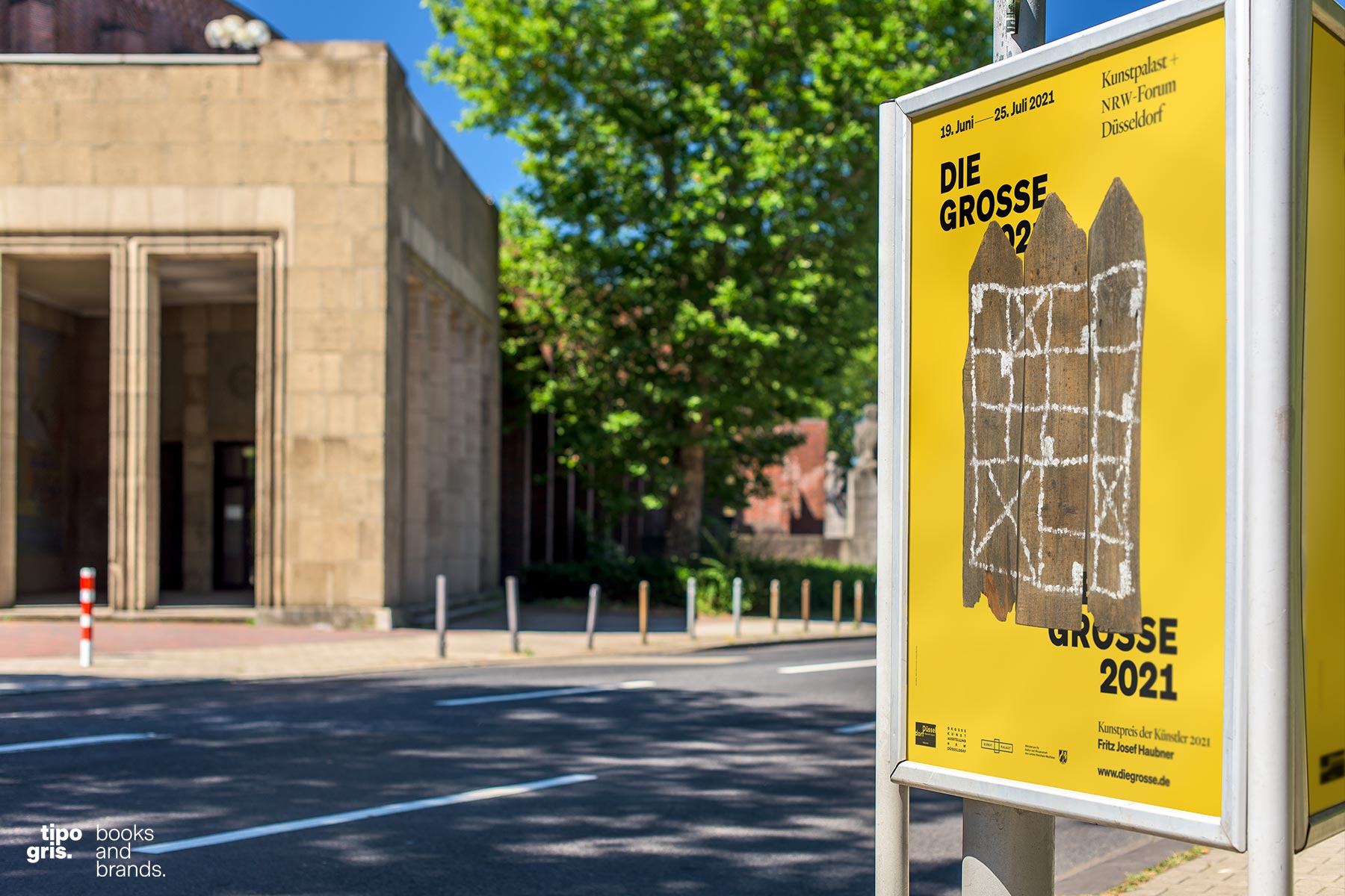
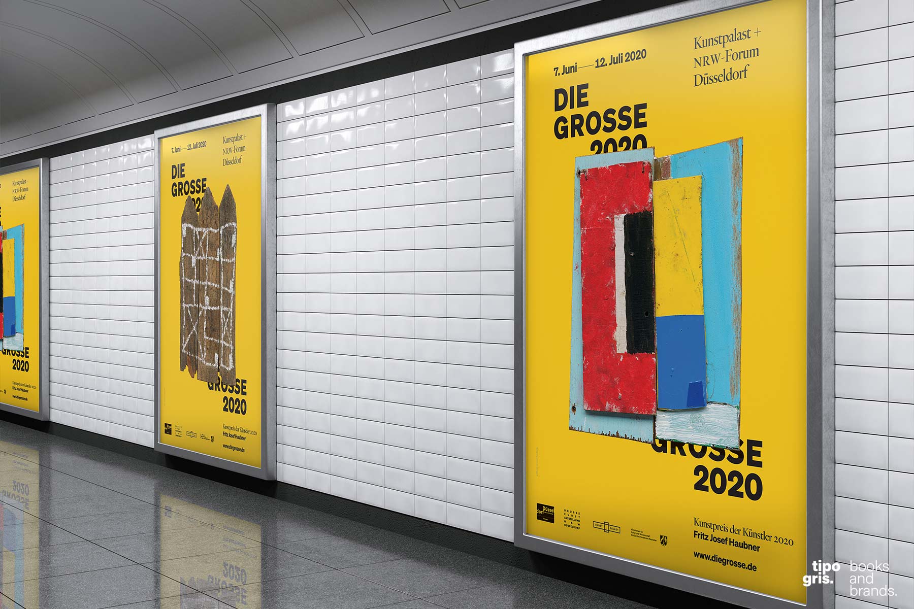
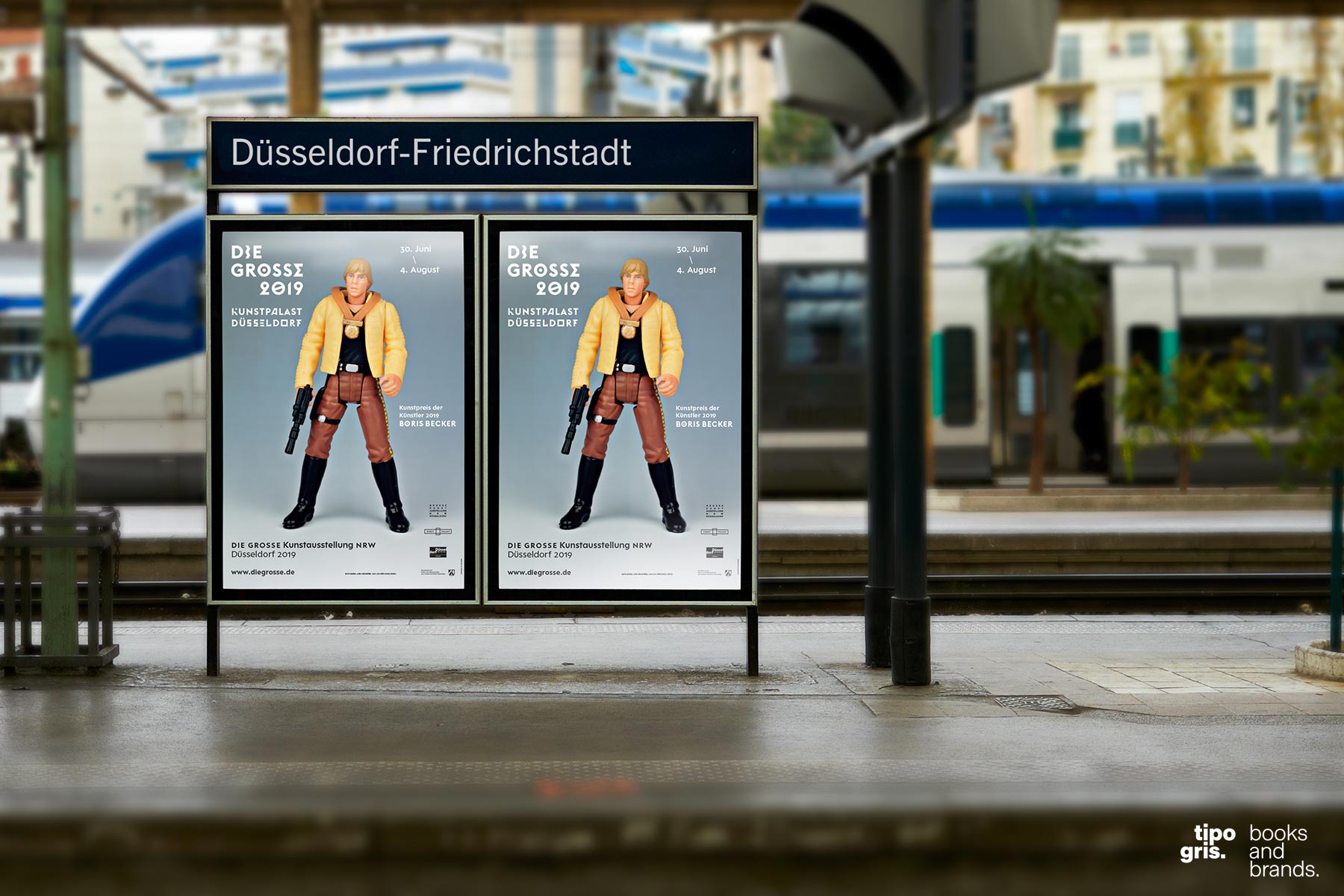
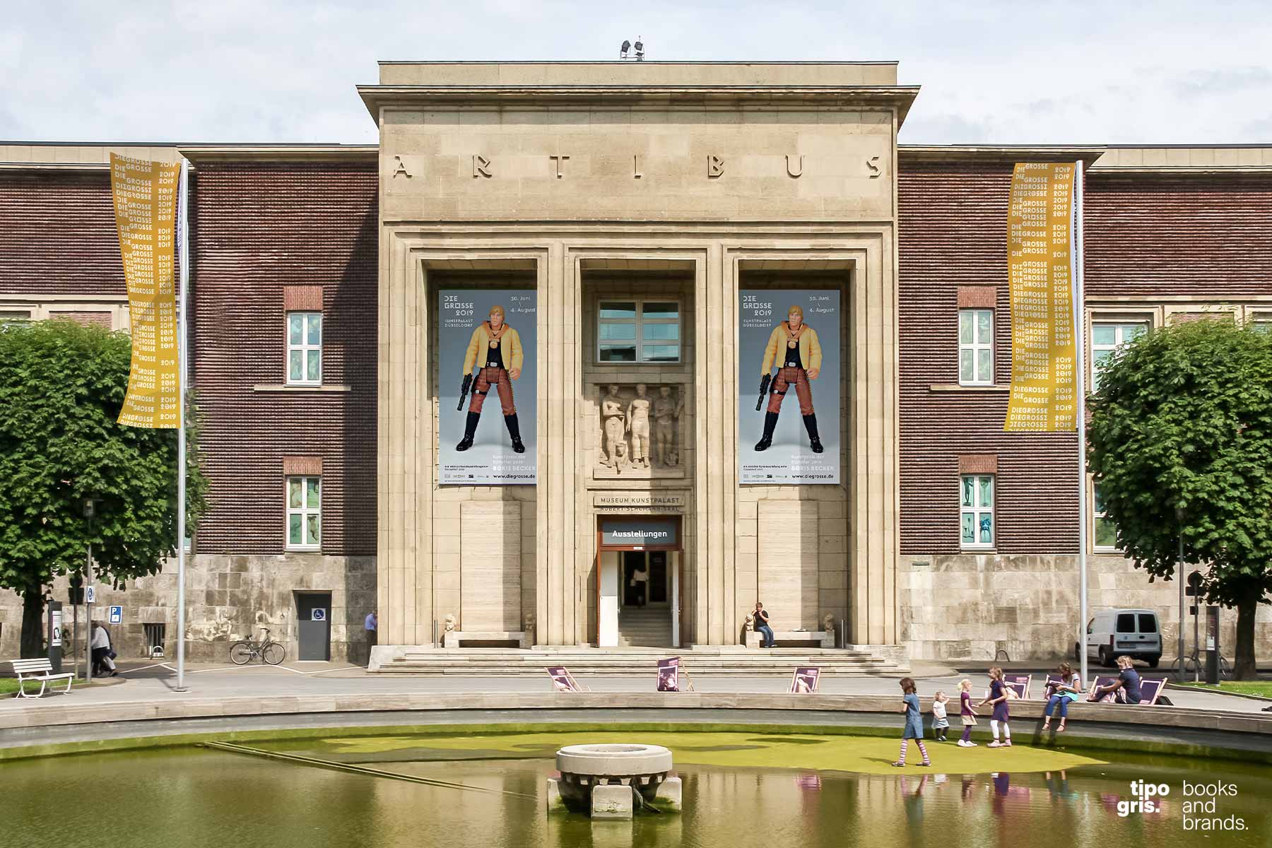
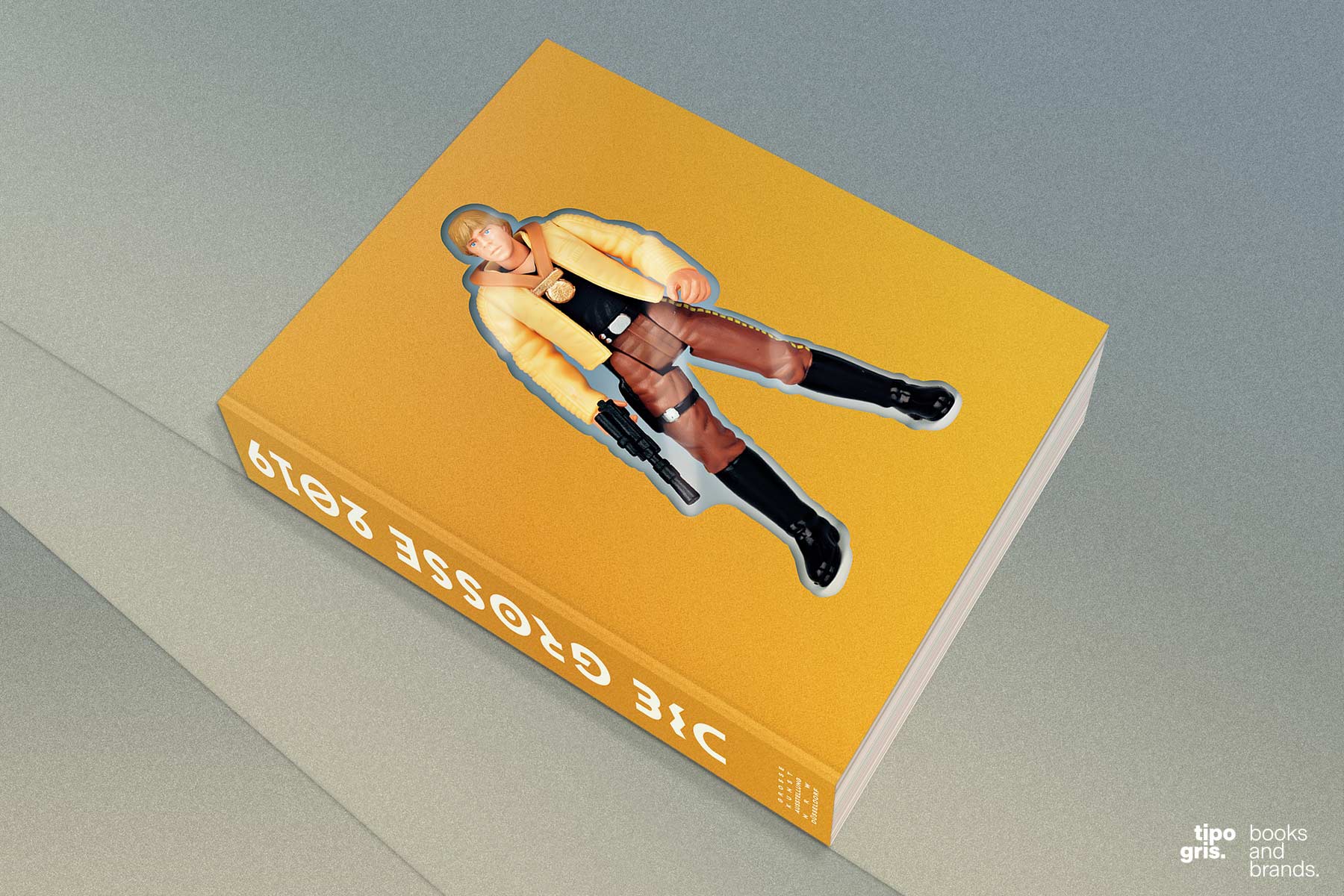
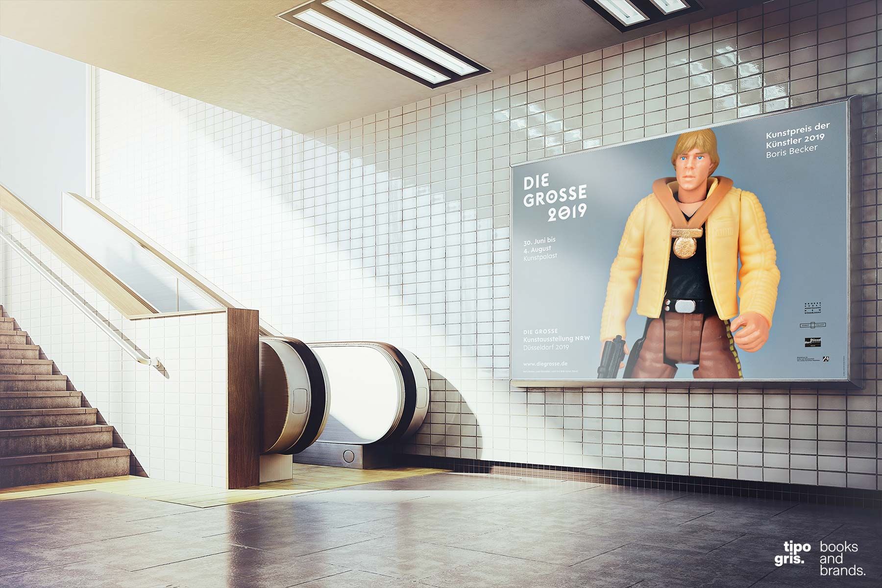
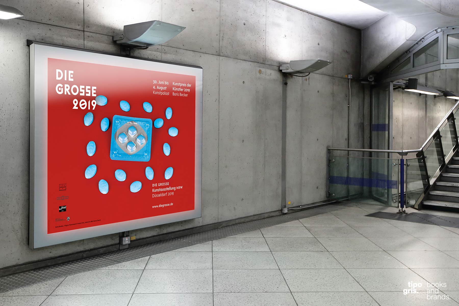
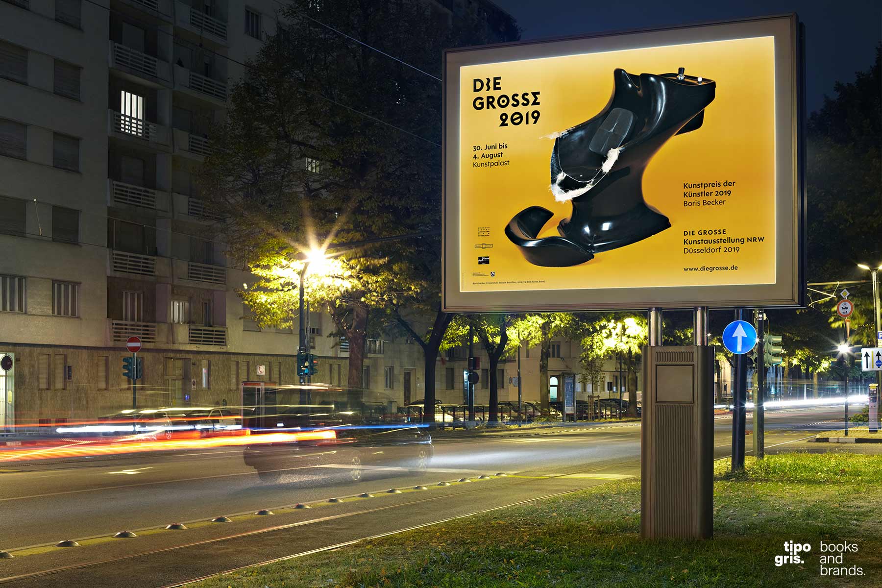
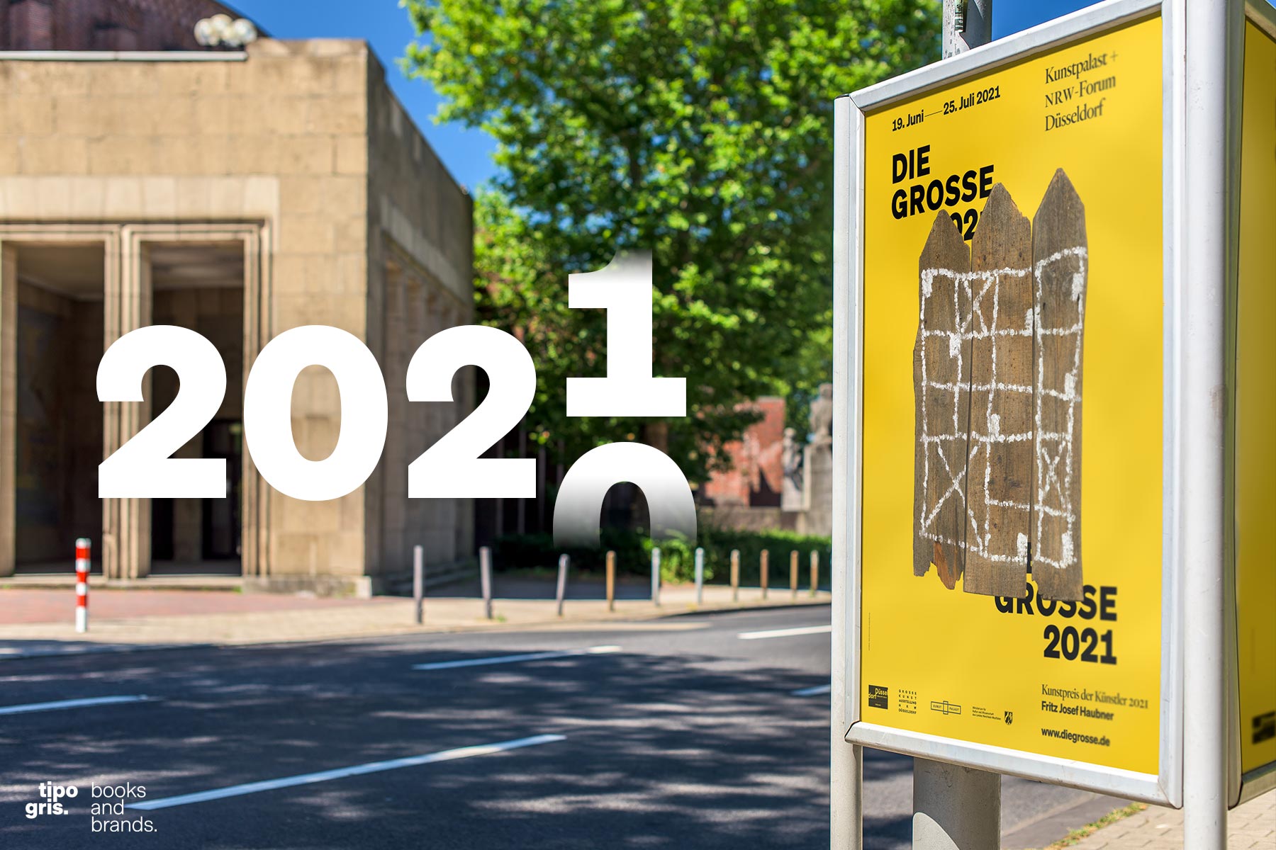
DIE GROSSE 2020 → 2021
Once more, Tipogris is honored to be responsible for branding & CI of Germany’s largest artist-organised art exhibition and one of the major annual art events of North Rhine-Westphalia. And once more, the redesign is inspired by the artworks of the recipient of the Artists’ Art Prize—Fritz Josef Haubner.
The 2020→2021 exhibition is expected to take place from June 19 through Juli 25, 2021.
Further information: www.diegrosse.de
Tipogris Books and Brands. We design publications and branding systems. Sometimes offbeat. Always precise.
© 2024 Johannes López Ayala / Tipogris Books and Brands. Tipogris® is a registered trademark. Impressum / Privacy Policy